In today’s fast-paced digital world, choosing the right institute is one of the most important decisions for building a successful career. Whether you are a student, a working professional, or someone looking to switch careers, having the right guidance, practical exposure, and industry-relevant skills is essential. This is where Techcadd stands out as a trusted and result-driven training institute.
TechCADD has built a strong reputation for delivering quality education, practical training, and career-focused learning. With years of experience in the training industry, it has helped thousands of students transform their careers and achieve their professional goals.
1. Industry-Relevant Courses
One of the biggest reasons to choose TechCADD is its industry-oriented curriculum. Unlike traditional learning methods that focus only on theory, TechCADD ensures that every course is designed according to current industry requirements.
Courses are regularly updated to match market trends, ensuring students learn the most in-demand skills. Whether it is web designing, digital marketing, graphic designing, CAD, or software development, every module is crafted to provide real-world knowledge.
This approach ensures that students are not just learning concepts but are also ready to apply them in real job scenarios.
2. Practical Learning Approach
At TechCADD, learning goes beyond textbooks. The institute strongly believes in a “learn by doing” approach.
Students get the opportunity to work on:
- Live projects
- Real-time assignments
- Case studies
- Practical tasks
This hands-on experience helps in building confidence and strengthens problem-solving skills. By the time students complete their course, they already have a portfolio to showcase their work, which gives them an edge in job interviews.
3. Expert Trainers
Another major advantage of TechCADD is its team of highly experienced and skilled trainers.
The faculty members are:
- Industry professionals
- Certified experts
- Experienced mentors
They not only teach concepts but also share real-world insights, industry tips, and best practices. Students also receive personalized guidance, making it easier for them to understand complex topics.
The focus is not just on teaching but on ensuring that every student truly understands and can apply what they learn.
4. Job-Oriented Training
TechCADD is not just a training institute—it is a career-building platform.
The courses are designed with a clear focus on employability. Students are trained in a way that prepares them for:
- Job interviews
- Freelancing opportunities
- Real-world work environments
Special attention is given to:
- Resume building
- Interview preparation
- Communication skills
This ensures that students are fully prepared to enter the professional world with confidence.
5. Placement Assistance
One of the biggest concerns for students is job placement. TechCADD addresses this by offering strong placement support.
The institute has connections with various companies and organizations, helping students get job opportunities after course completion.
Placement support includes:
- Job referrals
- Interview scheduling
- Career guidance
This makes TechCADD a reliable choice for students who are serious about building a successful career.
6. Affordable Fee Structure
Quality education should be accessible to everyone, and TechCADD ensures this by offering affordable and flexible fee options.
Students can benefit from:
- Budget-friendly courses
- Flexible payment plans
- Value for money training
Despite offering high-quality education, the institute ensures that students do not feel a financial burden.
7. Modern Infrastructure
TechCADD provides a modern learning environment equipped with the latest tools and technologies.
Facilities include:
- Well-equipped computer labs
- High-speed internet
- Updated software and tools
- Comfortable classrooms
This helps students learn in a professional and productive environment.
8. Small Batch Sizes
Unlike many institutes that focus on large batches, TechCADD maintains small batch sizes.
This ensures:
- Personalized attention
- Better interaction with trainers
- Faster doubt resolution
Students feel more comfortable asking questions and actively participating in the learning process.
9. Flexible Timings
TechCADD understands that students and professionals have different schedules. That’s why it offers flexible class timings.
Options include:
- Morning batches
- Evening batches
- Weekend classes
This flexibility allows students to learn without disturbing their existing commitments.
10. Certification
After completing a course, students receive a recognized certification from TechCADD.
This certificate:
- Adds value to your resume
- Increases job opportunities
- Validates your skills
Employers often prefer candidates with certified training, making this an important advantage.
11. Focus on Skill Development
TechCADD focuses not just on teaching but on overall skill development.
Students improve in:
- Technical skills
- Problem-solving abilities
- Creativity
- Communication skills
This holistic approach ensures that students are ready for both technical and professional challenges.
12. Supportive Learning Environment
A positive environment plays a huge role in learning, and TechCADD provides exactly that.
Students benefit from:
- Friendly faculty
- Motivating atmosphere
- Continuous support
Even after course completion, students can reach out for guidance and support.
13. Updated Tools & Technologies
Technology is constantly evolving, and TechCADD ensures that students stay updated.
Students learn:
- Latest software
- Modern tools
- Current industry practices
This helps them stay ahead in the competitive job market.
14. Strong Reputation
TechCADD has built a strong reputation over the years due to its commitment to quality education and student success.
Positive feedback from students and successful alumni reflects the institute’s credibility and effectiveness.
15. Career Growth Opportunities
Choosing TechCADD is not just about learning—it’s about long-term career growth.
Students can explore:
- Job opportunities
- Freelancing
- Entrepreneurship
The skills learned at TechCADD open multiple career paths.
16. Personalized Mentorship
At TechCADD, every student’s learning journey is treated as unique. The institute provides personalized mentorship to help students overcome their individual challenges. Trainers take time to understand each student’s strengths and weaknesses, offering customized guidance to improve performance.
This one-on-one support ensures that no student is left behind. Whether you need extra help with a topic or career advice, mentors are always available to guide you in the right direction.
17. Real-Time Industry Exposure
TechCADD bridges the gap between classroom learning and real-world application by providing real-time industry exposure.
Students get insights into:
- Current industry workflows
- Project management techniques
- Client handling practices
This exposure prepares students for actual work environments, making the transition from learning to earning much smoother.
18. Portfolio Development
In today’s competitive job market, having a strong portfolio is essential. TechCADD helps students build an impressive professional portfolio during the course itself.
Students work on:
- Live projects
- Practical assignments
- Creative designs
By the end of the course, they have a collection of work that showcases their skills and abilities, which can be presented to potential employers or clients.
19. Freelancing Opportunities
TechCADD not only prepares students for jobs but also opens doors to freelancing opportunities.
Students learn how to:
- Find clients
- Manage projects
- Deliver professional work
This is especially beneficial for those who want to work independently or earn extra income alongside a job.
20. Continuous Learning Support
Learning doesn’t stop after course completion, and TechCADD understands this well. The institute offers continuous learning support to its students.
Even after completing the course, students can:
- Clarify doubts
- Get career advice
- Stay updated with new trends
This long-term support ensures that students continue to grow in their careers.
21. Confidence Building
Many students hesitate to enter the professional world due to lack of confidence. TechCADD focuses on building confidence through regular practice, presentations, and interactive sessions.
Students gradually become more confident in:
- Speaking
- Presenting ideas
- Handling interviews
This transformation plays a crucial role in career success.
22. Networking Opportunities
TechCADD provides opportunities for students to connect with:
- Industry professionals
- Trainers
- Fellow learners
This networking helps students gain insights, share ideas, and explore new career opportunities.
23. Focus on Latest Market Trends
The digital world changes rapidly, and staying updated is key to success. TechCADD ensures that students are always learning according to the latest market trends.
This includes:
- Modern design techniques
- Updated coding practices
- Industry-standard tools
This keeps students relevant and competitive in the job market.
24. Career Guidance & Counseling
Choosing the right career path can be confusing, but TechCADD provides professional career guidance to help students make informed decisions.
Experts guide students on:
- Career options
- Skill development
- Growth opportunities
This helps students choose a path that aligns with their interests and goals.
25. A Step Towards a Successful Future
Ultimately, TechCADD is more than just an institute—it is a stepping stone towards a successful future.
With the right combination of knowledge, practical skills, and guidance, students are empowered to achieve their dreams and build a stable, rewarding career.
By choosing TechCADD, you are not just enrolling in a course—you are investing in your future, your skills, and your success.
Conclusion
Choosing the right institute can shape your future, and TechCADD proves to be an excellent choice for anyone looking to build a successful career.
With its industry-relevant courses, practical training, expert faculty, placement support, and student-focused approach, TechCADD provides everything needed to succeed in today’s competitive world.
If you are serious about your career and want to gain real skills that make a difference, TechCADD is the right place to start your journey.
Future Scope
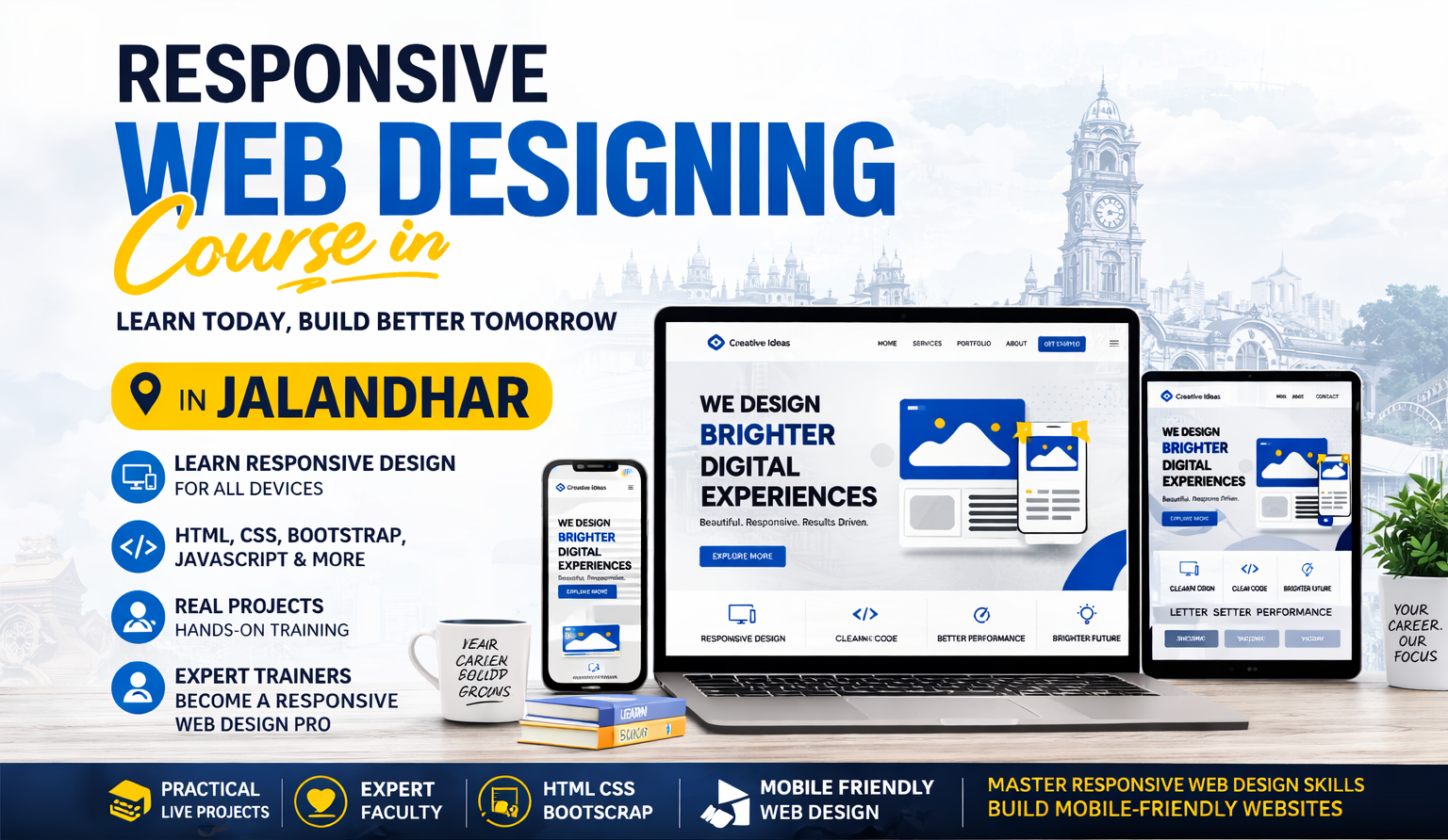
In today’s digital era, websites have become the backbone of businesses, communication, education, and entertainment. With the rapid growth of smartphones, tablets, laptops, and various screen sizes, the way users access the internet has changed dramatically. This shift has created a massive demand for responsive web designing, a technique that ensures websites adapt seamlessly to different devices and screen sizes.
Responsive web design is no longer just an option—it is a necessity. Businesses, startups, and even individuals now require websites that provide a smooth and consistent user experience across all platforms. As a result, the future scope of responsive web designing is not only promising but also continuously expanding.
Growing Demand for Mobile-Friendly Websites
One of the biggest reasons behind the rise of responsive web design is the increasing use of mobile devices. Today, a majority of internet users access websites through smartphones.
This trend is expected to grow even further in the coming years. Businesses understand that if their website is not mobile-friendly, they risk losing a significant number of customers.
Responsive web design ensures:
- Better user experience
- Faster loading times
- Improved accessibility
As mobile usage continues to dominate, the demand for responsive web designers will continue to increase globally.
Importance in Search Engine Optimization (SEO)
Search engines prioritize websites that are mobile-friendly and responsive. This makes responsive web design a critical factor in search engine optimization (SEO).
A responsive website:
- Ranks higher on search engines
- Reduces bounce rate
- Improves user engagement
Companies are investing heavily in SEO strategies, and responsive design plays a key role in achieving better rankings. This creates more job opportunities for skilled web designers.
Expansion of E-Commerce Industry
The e-commerce industry is growing at an incredible pace. Online shopping platforms require websites that function perfectly on all devices.
Responsive web design is essential for:
- Smooth navigation
- Easy checkout process
- Better customer experience
With more businesses shifting online, especially after global digital transformation trends, the need for responsive websites in e-commerce will continue to rise.
Career Opportunities in Responsive Web Designing
The future scope of responsive web designing offers a wide range of career opportunities. Some of the popular roles include:
- Front-End Developer
- Web Designer
- UI/UX Designer
- Responsive Design Specialist
- Freelance Web Developer
Professionals in this field can work in:
- IT companies
- Startups
- Digital marketing agencies
- Freelancing platforms
This flexibility makes responsive web designing a highly attractive career option.
Freelancing and Remote Work Opportunities
One of the biggest advantages of responsive web designing is the ability to work remotely. With the rise of freelancing platforms, designers can work with clients from around the world.
Freelancers can:
- Choose their own projects
- Set their own rates
- Work from anywhere
This provides financial independence and flexibility, making it a popular choice among young professionals.
Integration with Modern Technologies
Responsive web designing is evolving with new technologies such as:
- Artificial Intelligence (AI)
- Machine Learning
- Voice Search
- Progressive Web Apps (PWAs)
These technologies are shaping the future of web design. For example, PWAs combine the best of web and mobile apps, offering fast and engaging experiences.
Designers who stay updated with these trends will have a competitive advantage in the job market.
Role in Digital Transformation
Businesses across industries are undergoing digital transformation. From small businesses to large enterprises, everyone is moving online.
Responsive web design plays a crucial role in:
- Building brand identity
- Enhancing customer experience
- Increasing online presence
As digital transformation continues, the demand for responsive web designers will grow exponentially.
Importance of User Experience (UX)
User experience is one of the most important factors in website success. A responsive design ensures that users have a smooth and enjoyable experience regardless of the device they use.
Good UX leads to:
- Higher customer satisfaction
- Increased conversions
- Better brand loyalty
Companies are investing more in UX design, which increases the demand for skilled responsive designers.
Continuous Learning and Growth
The field of web designing is dynamic and constantly evolving. New tools, frameworks, and design trends emerge regularly.
Some popular technologies in responsive web design include:
- HTML5
- CSS3
- Bootstrap
- JavaScript
- React
Professionals who continuously upgrade their skills can achieve long-term career growth.
Global Opportunities
Responsive web designing is a globally recognized skill. Designers are not limited to local job markets—they can work internationally.
This opens doors to:
- Higher salary packages
- International clients
- Diverse work experience
The global demand ensures job security and career stability.
Entrepreneurship Opportunities
Responsive web designing also offers opportunities for entrepreneurship. Skilled designers can start their own:
- Web design agency
- Freelancing business
- Online service platform
With the right skills and marketing strategies, designers can build successful businesses and generate consistent income.
Increasing Demand in Every Industry
Almost every industry requires a website, including:
- Education
- Healthcare
- Real estate
- Retail
- Entertainment
This widespread demand ensures that responsive web designers will always be needed.
Future Trends in Responsive Web Designing
The future of responsive web designing will be shaped by several emerging trends:
1. Mobile-First Design
Designing websites primarily for mobile devices will become the standard approach.
2. Voice User Interface (VUI)
Websites will increasingly support voice commands.
3. Dark Mode UI
More websites will offer dark mode for better user comfort.
4. Minimalist Design
Simple, clean, and fast-loading designs will dominate.
5. AI-Powered Design Tools
AI will assist designers in creating faster and more efficient designs.
High Earning Potential
Responsive web designing offers attractive salary packages. Earnings depend on skills, experience, and expertise.
Professionals can earn through:
- Full-time jobs
- Freelancing
- Side projects
As demand increases, so does the earning potential.
Job Security and Stability
Unlike many other fields, web designing is not limited to a specific industry. Its demand is universal.
This ensures:
- Job security
- Long-term career stability
- Continuous opportunities
Contribution to Creative Expression
Responsive web designing is not just technical—it is also creative. Designers can express their creativity through:
- Layouts
- Colors
- Typography
- Animations
This makes it an exciting and fulfilling career.
Impact of Emerging Technologies on Responsive Web Design
As technology continues to evolve, responsive web designing is becoming more advanced and intelligent. Emerging technologies like Artificial Intelligence (AI), Augmented Reality (AR), and Virtual Reality (VR) are beginning to influence how websites are designed and experienced.
In the future, websites will not just adjust to screen sizes but also adapt to user behavior, preferences, and interactions. For example, AI can help in creating personalized layouts based on user activity, while AR and VR can provide immersive experiences, especially in industries like e-commerce, real estate, and education.
Responsive designers who learn to integrate these technologies into their work will have a significant advantage in the job market.
Rise of Progressive Web Applications (PWAs)
Progressive Web Apps (PWAs) are becoming a major trend in the web development industry. These are websites that function like mobile applications, offering features such as offline access, push notifications, and fast loading speeds.
PWAs rely heavily on responsive design principles to ensure smooth performance across devices. As more companies adopt PWAs, the demand for developers and designers skilled in responsive techniques will continue to rise.
This trend highlights how responsive web design is not just about layout but also about performance and user engagement.
Importance of Speed and Performance Optimization
In the future, website speed will play an even more critical role in user experience and SEO rankings. Users expect websites to load within seconds, regardless of the device they are using.
Responsive web designers will need to focus on:
- Optimizing images and media
- Reducing loading time
- Improving performance across devices
Fast and efficient websites not only improve user satisfaction but also increase conversion rates for businesses.
Role in Branding and Digital Identity
A responsive website is often the first point of interaction between a business and its customers. It plays a crucial role in shaping the brand image and digital identity.
A well-designed responsive website:
- Builds trust
- Enhances credibility
- Creates a strong first impression
As competition increases, businesses will invest more in high-quality web design to stand out. This will further increase the demand for skilled responsive designers.
Opportunities in Startups and Innovation
The startup ecosystem is growing rapidly, especially in digital and tech-based industries. Every startup requires a strong online presence, starting with a responsive website.
Responsive web designers can:
- Work with innovative startups
- Be part of new product development
- Contribute to creative digital solutions
This opens doors to exciting opportunities where designers can experiment, innovate, and grow professionally.
Cross-Platform Compatibility as a Standard
In the future, users will access websites not only through phones and laptops but also through smart TVs, wearables, and other smart devices.
Responsive web design will evolve to ensure cross-platform compatibility, allowing websites to function seamlessly across all types of devices.
Designers who understand multi-device optimization will be in high demand as technology continues to expand.
Continuous Innovation and Creativity
The field of responsive web designing will always remain dynamic and innovative. New design trends, tools, and technologies will keep emerging, making it a continuously evolving career.
This ensures that professionals in this field:
- Never face monotony
- Always have opportunities to learn
- Stay creatively engaged
For individuals who enjoy creativity and technology, responsive web designing offers a perfect balance of both.
Final Thoughts
The future of responsive web designing is not just secure—it is thriving. With advancements in technology, increasing digital presence, and growing user expectations, this field will continue to expand in new and exciting directions.
By mastering responsive web design and staying updated with industry trends, individuals can unlock countless opportunities and build a successful, future-proof career in the digital world.